absurdity & happiness
“They had thought with some reason that there is no more dreadful punishment than futile and hopeless labor.” ~ Albert Camus
The myth is graphed…
My musings about labor identity started when I was on social media and came across a graph depicting workplace unhappiness. At the time I was reading Albert Camus’s The Myth of Sisyphus for the Mythologies course I teach at a community college. The course focuses on the power of cultural mythmaking, and the importance of shared stories to our understanding of our positions within culture and to humanity’s historical relationship with the gods. Camus’s essay and the data felt pertinent to my personal, professional, and scholarly work. As a US citizen, in a professional job, and an amateur scholar and graduate student, who often wonders about the meaning or purpose of my work, the graph resonated. I kept returning to Camus statement: “The gods had condemned Sisyphus to ceaselessly rolling a rock to the top of a mountain, whence the stone would fall back of its own weight. They had thought with some reason that there is no more dreadful punishment than futile and hopeless labor.“[i]
Camus theorized the human predicament as such – the universe, and our purpose within it, is unknowable. The knowledge of our purposelessness in the context of limited existence is devastating, especially, if we consider the amount of time we work. In fact, the work itself may be meaningless because of the knowledge of limited existence and the expansiveness of the universe. Focusing on our finitude leads to hopelessness, and so we have two choices: revel in our hopelessness and experience a death of the mind, or we “must imagine Sisyphus happy” as he turns, briefly free(?), to exist without work. For his cleverness, Sisyphus, the king who cheated death twice, is condemned to repeatedly role a rock up a mountain – his existence – a repetition of meaningless labor. Only in the turn is there a potential reprieve for Camus. Sisyphus finds his freedom in the space in between labor and rest, or, at least for Camus, the turn is the moment we must imagine happiness.
The narratives about work, and the cultural values around types of work, are historical, created within systems of information, and an integral to understanding ourselves and our value within culture. The graph prompted me to consider how data acted as part of the narrative for labor identity.[ii] Data often tells stories and contributes to our understanding although very few of us understand the nuances of statistics. Which made me ponder: how is data critically read, and what role does data play in cultural narratives about work and labor identities?
Data and data visualizations (graphs, charts, maps, etc.) arrive with cultural expectations of accuracy and “fact.” We give data a powerful position of authority when we consume information, and yet data, like other types of information is influenced, interpreted, and understood by the construction of visualizations (effective and possibly suspect), as well as by the presentation of data, authorial and publication intentions, and the biases producers and consumers bring to reading. In a graduate course I recently read Edward Tufte’s “principles of graphical excellence,” which prompted me to critically examine the workplace happiness graph.[iii] The graph with the accompanying question “why are Americans so unhappy at work,” kept reminding me of Sisyphus rolling the rock, who Camus describes as an “absurd hero.”
On December 3, 2023, the Wall Street Journal (WSJ)[iv] posted on Instagram: “Americans Are Unhappier at Work Than They Have Been in Years” with a line graph depicting “Employee job-satisfaction score.” The data on the graph came from BambooHR’s survey of employees spanning from 2020-2023, and the “Average employee Net Promoter Score®” 36-45. According to an asterisk the data description, the graph is “based on ratings from 57,000 employees at more than 1,600 companies of how likely they are to recommend their organization as a place to work.” The graph is black and white, with a red line tracing the data points. When first I took a screenshot (figure 2) in January 2024 the article had 26,280 likes and over 800 comments.
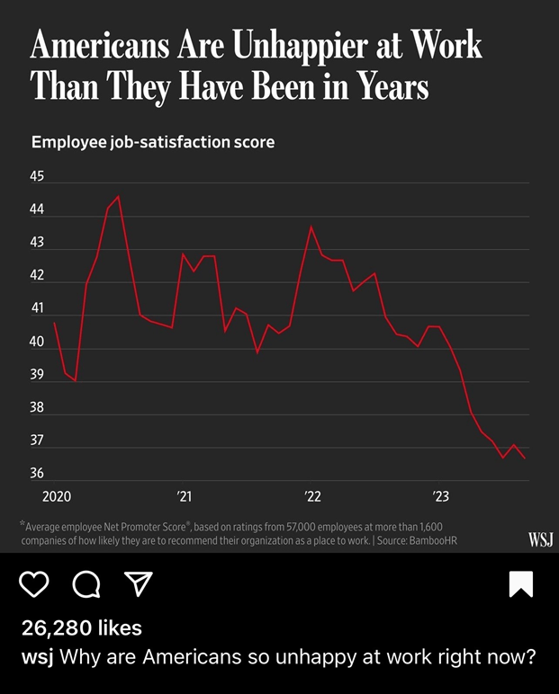
On closer inspection, while the data is easy to interpret (most viewers spend less than two seconds on a post)[v] understanding the data requires reading the accompanying post and article, as well as additional research outside social media and WSJ article. The caption under the graph mentions Gallup’s 2023 workplace report[vi], as well as BambooHR’s survey for measuring employee happiness. The measurement of happiness is a “Net Promoter Score®”, and to find the how this score is created, I watched several different BambooHR video explanations[vii]. According to their website BambooHR’s Employee Satisfaction survey (2024), “asks your employees two questions relating to the health of your organization: how likely would you recommend the organization as a place of work, and what changes would you recommend to make this organization a better place to work?”[viii] Employees surveyed rank their likelihood of recommending their employer on a scale of 1-10, and their responses are calculated to create an “Employee Net Promoter Score (eNPS)” by taking “promoters” (those who rank the organization nine to ten) from the “detractors” (employees who rank the organization from zero to six). The final sum supposedly represents the percent of employee job satisfaction. The peaks and valleys of the graph seemingly indicate employees’ ranking of their employer at different organizations, who are surveyed throughout the years by BambooHR. The organizations surveyed are in “multitude of sectors”, representing1,600 different companies, and the surveys are given to a variety of positions. The data seems problematic, especially with the definitive title “Americans are Unhappier at Work Than They Have Been in Years.”
After reading the article and tracing the data, I wondered: what is the story of the data? The first question below the data is “Why are Americans so Unhappy at work right now?” and follows in reply on the social media post: “despite wage increases, more time off and greater control over where they work” Gallup report indicates more employees are disengaging. The data from the visual is referenced as BambooHR’s data on 57,000 employees since 2020 and the decline in employee satisfaction as akin to workplace happiness. Employees interviewed express the need for flexibility, and unhappiness attributed to long commutes for those who returned to the office, as well as inflation, and the “unsettled nature of the workplace.”[ix]
The content of the full article vacillates between the bafflement of managers/employers “despite” all the changes employees are unhappy, to the narratives of individuals expressing their personal dissatisfaction.” “The Wall Street Journal (WSJ) was founded in July 1889. Ever since, the Journal has led the way in chronicling the rise of industries in America and around the world. In no other period of human history has the planet witnessed changes so dramatic or swift.” The WSJ is owned by NewCorp and part of the Dow Jones brand, and indicate their primary audience is business professionals and investors;[x] however, when using social media, the WSJ expands their reach to a wider audience. The full article is behind a paywall and the corresponding social media post ends with “Those in charge said they have given staff more money, flexibility and support, only to come up short.”[xi]According to Pew Research, 50% of Americans receive their news from social media although what they don’t like is the “inaccuracy” and “low quality” of news on social media[xii]. Audience is a key to reading the data, and data, social media post, and accompanying story are directed more toward employers, then employees. In the comments, one commenter state, “Overworked, underpaid, subject to layoffs…but expected to be “engaged” and loyal to their employers.”[xiii] The comment had a few hundred likes. Two assumptions are created by the graph. First data put out for public consumption expects (or not?) that readers have data literacy and know (or not?) some principles of “graphical excellence.” Second, and the story that interests me, workplace happiness is measurable.

According to BambooHR “employee satisfaction link to positive workforce morale, higher engagement, increased retention, and better financial outcomes. It’s important to know how satisfied, or happy, your employees are.”[xiv] The survey of job satisfaction is a consumable product which will create data dashboard for human resource departments and company leadership professionals. In exploring the data as published on Instagram, I held up Tufte’s principles and considered each[xv]. Rather obviously I found the data interesting and eye-catch, hence this discussion, but in exploration I questioned the substance. The survey of 57,000 employees over four years represented customers of BambooHR and cannot be considered a scientifically valid sample of American workers, as the headline implies. The spread of sectors and industries represented in the sample are opaque, even after visiting BambooHR’s website. The makeup of the 1,600 companies represented in the graph is unclear, which matters when we discuss satisfaction or happiness in the American workplace. The information in the graph is clearly communicated but the data points lack explanation. I will say the headline, redline, axes[xvi], data title, and asterisk explanation are all fascinating and generated plenty of questions, including can happiness be measured, and after further research on the BambooHR survey, can two questions measure happiness? Also, is job satisfaction the same as happiness? The data contains year and “Net Promoter Score®”, so obviously multivariate. But at Tufte’s last demand for excellence I balked – truth is immeasurably complicated. Tufte means to say does the visualization provide an accurate and proportioned presentation of the data, and the data’s mathematical range, the caption, sample, as well as each data point is unclear and rather vague.
Despite the historical audience of the WSJ of “business professionals and investors,” social media reaches a wider demographic of readers, including top news consumers on Instagram age 28-34.[xvii] The difference between the printed/digital article and the social media post is the leading graphics and on Instagram a shorter version of the story is listed below the image. The image on the printed/digital journal is not data but a head exploding with a phone and computer apparently shouting at the worker, and when I recently revisited the text has smiley faces on computer screens, but I could not move past the paywall.
The difference between social media and article are important when we consider the data because where media is consumed changes the audiences’ expectations. The data in this story is also symbolic of the data used in the much larger narrative of the workplace. Happiness is recommending an employer and measuring workplace happiness is important to industry. Importantly, within that narrative about work: data signals facts. The data is important to the readership because it implies a steep decline in workplace happiness, yet the source of the data is problematic as a measurement of workplace happiness.
The full article features stories from the employees which include remarks on increased/changing “in-office requirements” and shifting job duties and responsibilities, as well as “feeling trapped,” “zero humanity” and lack of relationships in remote work. One woman remarked the regrets of being worn-out from work and a long commute and then being short tempered with her children. The balance between work and family, in which identities compete for priority, is magnified by the time spent commuting, not just working. While the job duties and in-office requirements signal a reason for employees to recommend, or not, their employer (unhappiness as equates to the graphic), we also are reading comments on the value of time, of relationships, and desire for meaningful work. Employer satisfaction is not only the conditions of work which matter to the individuals quoted in the article. The purpose of work, the quality of the experience working with others, and the time spent are all factors toward the individual’s happiness.
Why are workers unhappy? Well according to Camus, the Greek gods saw repetitive, purposeless work a just punishment for a man who attempted to cheat death (twice). Sisyphus, the absurd hero, is the ultimate example of what humans can expect in a cold, indifferent universe. Death is inevitable and the endless, purposeless work is also inescapable (that email you spent hours carefully constructing has already been forgotten). The unknowable universe and the purpose of existence remains shrouded in mystery, and we cannot know the answer[xviii] to our existence. We face three fates: death, purposeless work, and mysterious existence. Camus frames our choice in this indifferent, seemingly purposeless existence as either suicide or freedom of perspective, a freedom we enact only when we are not working, as in when Sisyphus chases the rock down the mountain. Time is essential to Camus’s point: we are finite, conscious beings in a seemingly infinite universe. We don’t want to spend our brief lifetime toiling without meaning, especially if the meaning of the universe is hidden from us. Perhaps another graphic would illustrate an understanding of worker unhappiness? If we consider time as a factor, which the quotes form workers in the article indicate, perhaps we might better understand workplace happiness?
[i] Camus, Albert, The Myth of Sisyphus (Vintage International, 2018).
[ii] My working definition of labor identity is the mythical narrative about work, and the identification with that narrative, as opposed to profession or career or title which are labels. Labor identity is the culturally constructed story of the work, and the adoption of that story as one’s own in the creation (care) of the self.
[iii] Edward R. Tufte, The Visual Display of Quantitative Information, 2nd Ed., 2nd edition (Cheshire, Conn: Graphics Press, 2001).
[iv] Fuhrmans, Vanessa, and Lindsay Ellis. “Why Is Everyone So Unhappy at Work Right Now? U.S. Employees Are More Dissatisfied than They Were in the Thick of the Pandemic.” Wall Street Journal (Online), November 27, 2023, sec. Management. https://www.proquest.com/docview/2893681029/citation/5E9AAEE9AB0349BDPQ/1.
[v] Most of the research produced on audience engagement in social media is produced by marketing firms. Some information is available from peer reviewed research is over fifteen years old. Current, peer reviewed research I reviewed focused on overall time spent on social media, not by audience impression per story. The marketing companies repeatedly said: 2 seconds is the max time you have tocapture an audience, but not one of the sites I visited (11 in total), sited a source for that “data.”
[vi] The 2023 report is no longer available for download, but for reference of the report’s contents: Inc, Gallup. “State of the Global Workplace Report.” Gallup.com. https://www.gallup.com/workplace/349484/state-of-the-global-workplace.aspx.
[vii] BambooHR, “Introduction to Employee Satisfaction and Employee Wellbeing,” accessed January 10, 2024, https://help.bamboohr.com/s/article/1545225.
[viii] BambooHR. “Introduction to Employee Satisfaction and Employee Wellbeing.”https://help.bamboohr.com/s/article/1545225.
[ix] Fuhrmans and Ellis, “Why Is Everyone So Unhappy at Work Right Now?”
[x] Dow Jones. “Homepage.” Dow Jones. Accessed January 26, 2024. https://www.dowjones.com/.
[xi] BambooHR, “Introduction to Employee Satisfaction and Employee Wellbeing.”
[xii] Wang, Luxuan, and Naomi Forman-Katz. “Many Americans Find Value in Getting News on Social Media, but Concerns about Inaccuracy Have Risen.” Pew Research Center (blog). Accessed February 3, 2024. https://www.pewresearch.org/short-reads/2024/02/07/many-americans-find-value-in-getting-news-on-social-media-but-concerns-about-inaccuracy-have-risen/.
[xiii] Fuhrmans and Ellis, “Why Is Everyone So Unhappy at Work Right Now?”
[xiv] BambooHR, “Introduction to Employee Satisfaction and Employee Wellbeing.”
[xv] Edward R. Tufte, The Visual Display of Quantitative Information, 2nd Ed., 2nd edition (Cheshire, Conn: Graphics Press, 2001).
[xvi] Yes, the plural of axis is axes. I also didn’t believe axes was correct. “Axes vs. Axis: What’s the Difference?” https://www.grammarly.com/commonly-confused-words/axes-vs-axis.
[xvii] Pew Research Institute.“Social Media and News Fact Sheet,” Pew Research Center’s Journalism Project (blog), accessed February 1, 2024, https://www.pewresearch.org/journalism/fact-sheet/social-media-and-news-fact-sheet/.
[xviii] Possibly 42.
